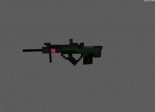
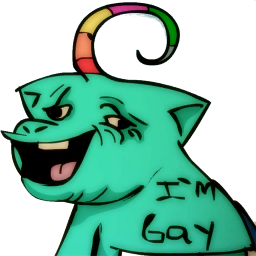
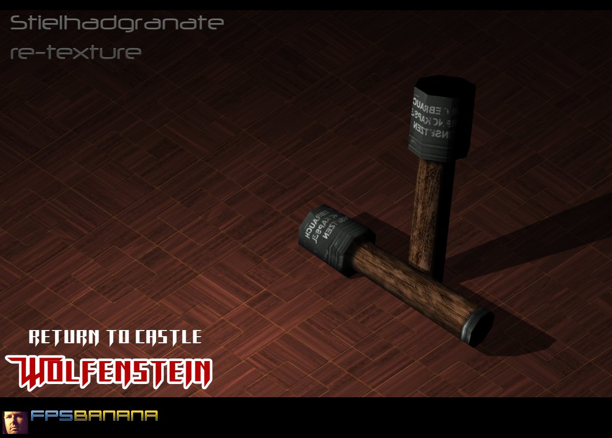
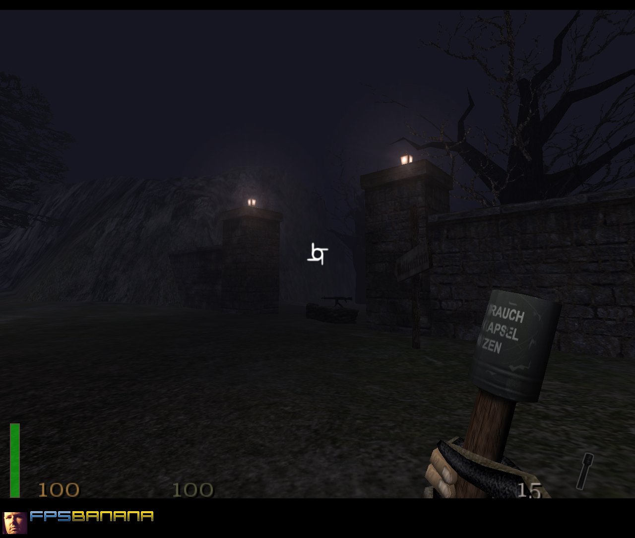
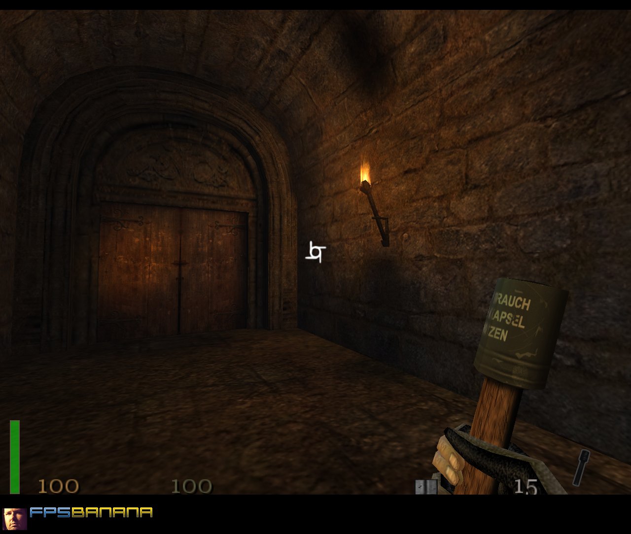
Stielhadgranate re-texture
Skin featuring custom 512*512 instead of default 128*128 :D Text looks good in game, not like on render! I hope you like!

Want access to cool stuff? As a member you can:

It wouldn't put up my score. But I gave a 9.3

Pros blah cons none imps none notes YAY 100/10

Was it assessment?

Nice to see people caring for old games. While there is no argument this outdoes the original, there is still a lot to be said about the skin. Looking at the texture, it's a bit dual. First, those grooves in the wood are way too sharp and uniform. The wood could have been done better. Looks like a simple 90degree motion blur with a pinched and embossed overlay to give it definition. Not that there's anything wrong with that, it just looks too dull. The whole skin could use a better lighting gradient. The way the texture is split makes it harder to do it seamless, but do something at least. Looked great on the grooves, would have been nice to see that on the whole skin. The color of the text doesn't blend with the skin, and has no sort of effect, just looks floating. The damage looks nice but is incomplete. Use a dodge 1pxl brush at highlight 30% and go over the edges of the scraped off paint, along with the notches of the grenade to give it some realistic scratches. Like I said, better than default, good start, but needs more work.


Yep

Like now?
Bcuz its hard to give a mark sometimes
Why so bad?
Meh i dont asses things...
Yeah :D Maybe you'll give me an assessment here?


 Ace of Spades
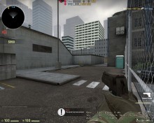
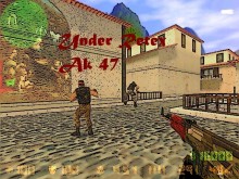
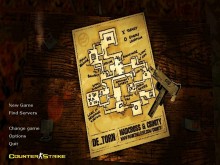
 Counter-Strike: Global Offensive
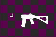
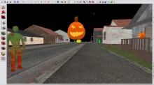
 Contagion
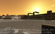
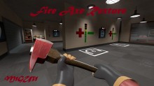
 Team Fortress 2