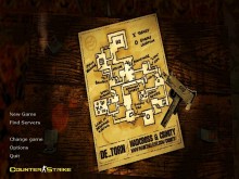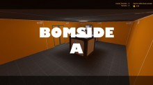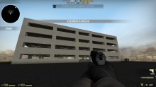
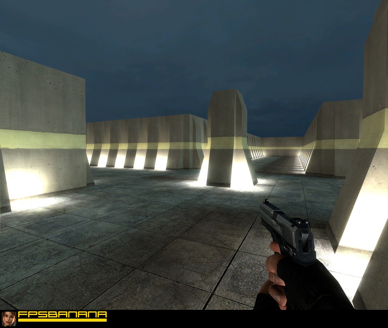
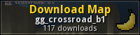
Beta of my new map. Check it and you can give some ideas for this map. This is basic layout
gg_crossroad_b1
( )
Oh noes! You're not a Member!
Want access to cool stuff? As a member you can:
- Post. Give the submitter your thoughts on this Map.
- Say Thanks. Show your appreciation by sending the submitter points.
- Stamp Posts. Let other posters know what you think of their posts.
- Rate. Give this Map a rating out of 10.
- Flag. Alert moderators and warn members of a problem with this Map.
- Vote. Vote the submitter for the Monthly Awards.
- Subscribe. Get notified when this submitter submits again.
Comments
-
Nice i like it it reminds me strongly of old Quake II multiplayer = )
Hells a joke compared to my wr -

 jjjrmy's Levels
-

P1: Beggar
Points: 69 -
E1: Helper
EF: 8 -

C1: Member
-
A5: Veteran
Account Age: 4 years
Reminds me of the walls in de_nuke
 User Title/* No Comment */
 -
-
 The BucKeT's Levels
-
P3: Peasant
Points: 23,697 -

E5: Opinion Leader
EF: 185 -

C2: Ripe Member
-
A5: Veteran
Account Age: 4 years
 UsernameThe BucKeT
Hi Inspector
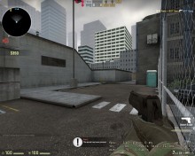
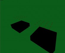
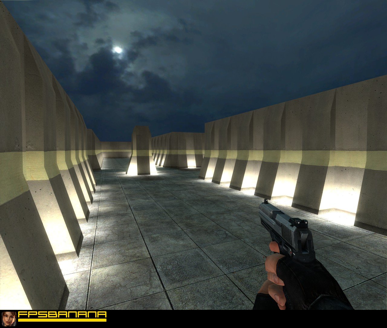
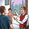
So far so good. I know this is just a work in progress so I can only assess what you have accomplished so far. The brushwork is awesome on the outer walls. Very clean with no overlaps. Also the texture for the outer walls imo was also a good choice. The yellow line lays perfect where the angle changes. The lighting looks awesome although with that many lights I think you could lower the brightness just a tad. Not much though.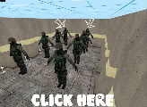 I'm not so sure about the layout though. Example right. If this map is used on a server that does not use noblock, I can see where the players that spawn in the back will get trapped in due to the fact that there is a row of players that spawn in front of them. One idea might be to widen the hallways to help with this issue.
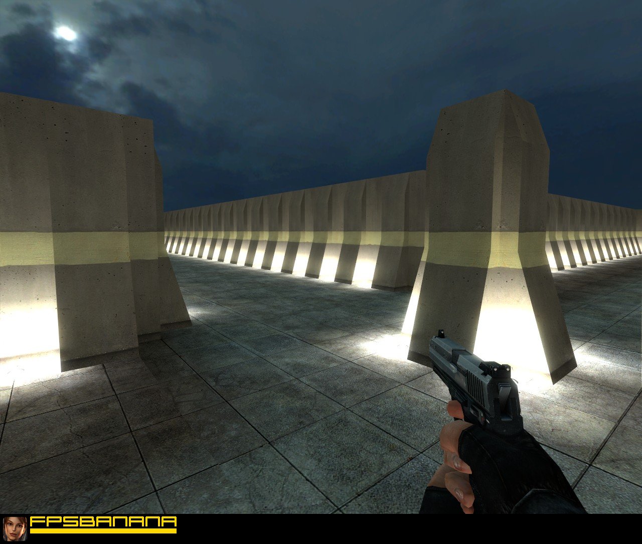
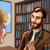
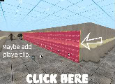 Another thing I noticed is that sometimes I would get caught up on the outer walls because of the rib effect. Example left. To eliminate this you could add some player clip as seen in the screenshot. Again, I know that this is just a beta version so the score does not really reflect on your work. This is just a starting point, and I know with your mapping skills that this will be a work of art when you finish the map.
 User Title-= DON'T BLINK, JUST WINK =-
 -
-
 Teh Inspector's Levels
-

P4: Worker
Points: 25,514 -
E2: Guide
EF: 29 -
C1: Member
-
A5: Veteran
Account Age: 4 years
Thanks, I'll leep it up) As I said, this is only beta...
 User TitleThoughtless
 -
-
 nosoul's Levels
-
P3: Peasant
Points: 16,763 -
E4: Teacher
EF: 115 -
C2: Ripe Member
-
A5: Veteran
Account Age: 6 years
 Usernamenosoul
Pros: Hey inspector,
Here are a few things that I liked.
- I like how you added some detail to the walls instead of keeping them flat. They add a good amount of detail and really bring the theme of the map together.
- The excessive amount of lights you have is actually a good thing and I think that this sort of lighting is better than lighting coming from the sky.
- The gameplay is actually pretty fun, and I wish you had included it in the criteria. I found that when playing, almost all the weapons (I didn't test all of them) could be used in the map. It was pretty fast and fun, and I had a good time raping the bots. There was a good amount of cover from the walls, and the pillar in the middle.
- I think you have the bloom scale turned up way to high on the HDR. This causes the lights to become really bright when you are close to them, and it just looks awful. There is a tutorial made by sgtkickur_ass that tells you how to lower the bloom scale to make it look more realistic.
- I don't like that you are only using 2 textures in the entire map. While this isn't a huge deal, and your map still looks pretty good, I would love to see you branch out and use some more. Maybe a texture like tile that would benefit from the HDR, maybe some water in the middle. Just to branch out a bit.
- Change the bloom scale on the HDR
- Add more textures
 User TitleWhy I laggin?
 -


Credits
- Submitter
-
Teh Inspector (Creator/Co-creator)Teh Inspector's Levels
-
P4: Worker
Points: 25,514 -
E2: Guide
EF: 29 -
C1: Member
-
A5: Veteran
Account Age: 4 years
-
- Studio
-
 StudioWreckreations Inc
 - Key Authors
-
- !n$pect0r
- Unknown
Rating
7.67/10
Based off 3 rating(s)
Additional Info
- Development State
- Beta
- Version
- 1.0
- Maximum Players
- 32
Stats
- Post Count
- 5
- ViewCount
- 781
- Downloads
- 117
- Date Added
- 4 years ago
- Date Modified
- 4 years ago
DevNotes
Hammer
License
N/A
Share
SubFeed
-
2 mins ago:
Details
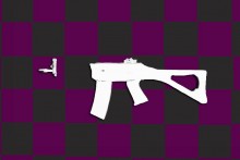
- Section
- Skins
- Submitter
- Dr.Squeeze
- Game
-
 Ace of Spades
-
3 mins ago:
Details
- Section
- Threads
- Submitter
- PixelBlast
- Game
-
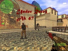
 Counter-Strike: Source
- 39 mins ago:
-
1 hour ago:
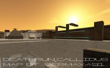
Details
- Section
- Maps
- Submitter
- TaskuVaras
- Game
-
 Counter-Strike: Global Offensive
-
1 hour ago:
Details
- Section
- Maps
- Submitter
- .:SeRMaXa91:.
- Game
-
 Counter-Strike 1.6
- 2 hours ago:
- 2 hours ago:
-
2 hours ago:
Details
- Section
- Ideas
- Submitter
- The Giblets of Jesus
-
3 hours ago:
Details
- Section
- Threads
- Submitter
- Tabajara 7.7
- Game
-
 Contagion
- 4 hours ago:
-
4 hours ago:
Details
- Section
- WiPs
- Submitter
- Tabajara 7.7
- 4 hours ago:
- 4 hours ago:
-
4 hours ago:
Details
- Section
- Sprays
- Submitter
- Julius Harder
- Game
-
Counter-Strike: Source
-
4 hours ago:
Details
- Section
- Sounds
- Submitter
- Techno_Lad97
- Game
-
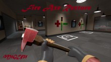
 Team Fortress 2
- 5 hours ago:
-
5 hours ago:
Details
- Section
- Maps
- Submitter
- Julius Harder
- Game
-
Counter-Strike: Source
- 5 hours ago:
- 5 hours ago:
- 5 hours ago:
- 6 hours ago:
- 6 hours ago:
- 6 hours ago:
- 6 hours ago:
-
6 hours ago:
Details
- Section
- WiPs
- Submitter
- FBalazs369