Wreckreations Inc
Your #1 source for wrecked releases!
Wreckreations Inc
Your #1 source for wrecked releases!
 Wreckreations Inc
Your #1 source for wrecked releases!
Wreckreations Inc
Your #1 source for wrecked releases!Want access to cool stuff? As a member you can:


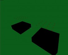
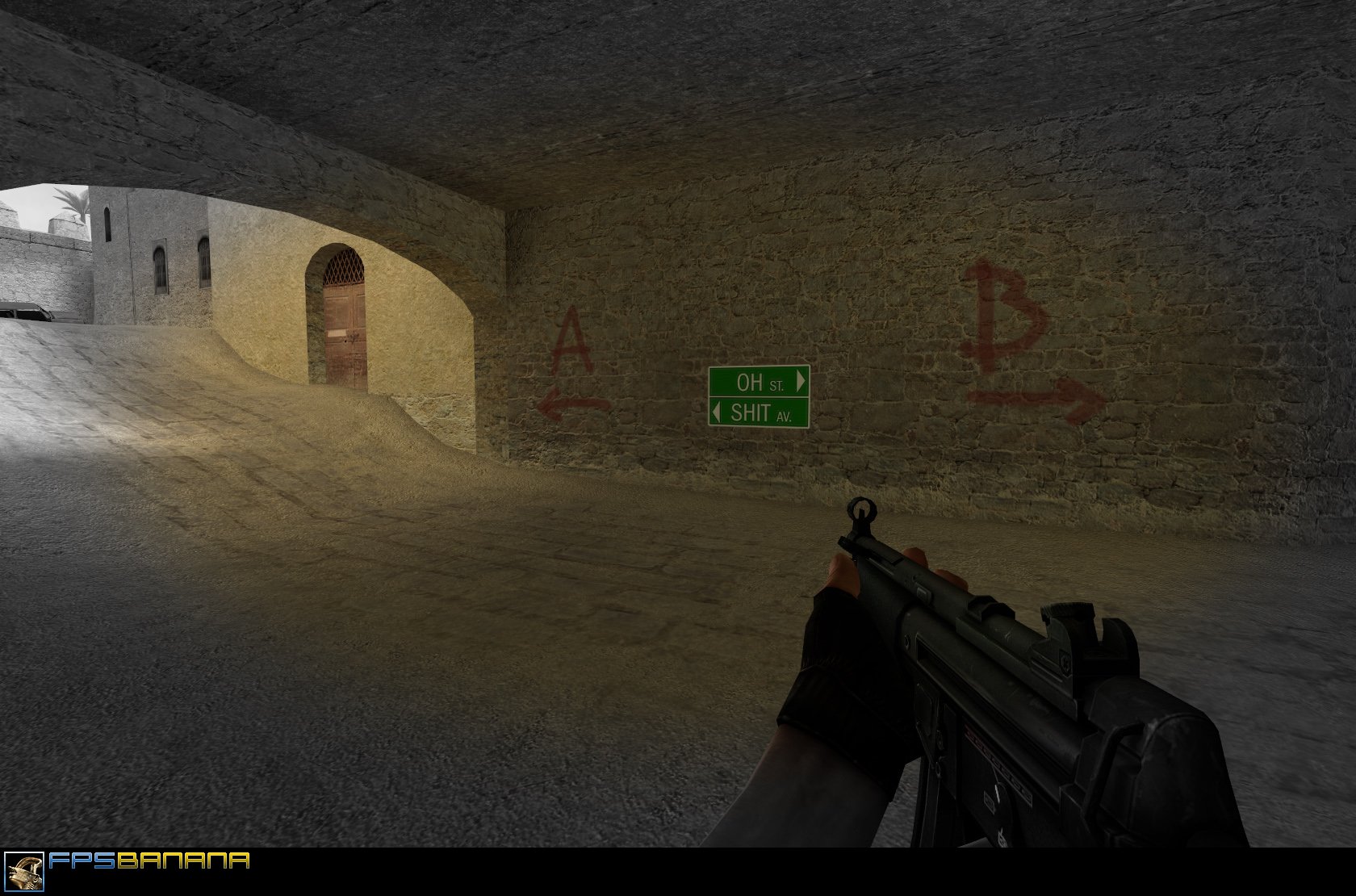
OH>
<SHIT

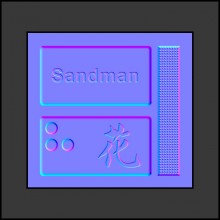
Pros: Nice and original spray. This is some pretty good and creative humor, made me giggle a bit, but still didn't make me laugh too much. The quality of the image looks pretty good and designed alright overall. I don't remember seeing this in Superhero movie, if you say that's your inspiration, but I've seen it a while ago.
Cons: Should have made it look like a real street sign for a better realism. I also think that green is a bit too bright, should have darkened it a bit along with the text. If I were you, I'd take a real street sign and cut off the pole, then just photoshop the text on there. It shouldn't be too hard right?
Improvements: Like I said, darken the thing a bit. Try a tad darker colors and text. Perhaps add some wearing on it, I rarely see street signs with the text still not wearing off. Something like this would work wonders and make the spray funnier. Of course you should remove the pole so it's not cut off and add some shadows, but you are more than capable of doing something like that right? Try it out man, good luck.
Notes: Nice spray dude! Still funny stuff, keep your sprays coming. I haven't been around to assess stuff for a while, a bit more tied up with doing other things now than assessing stuff, but I'm coming back to it slowly. Can't wait to see what you make next.


 Ace of Spades
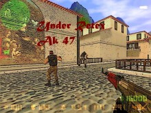
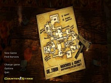
 Counter-Strike: Global Offensive
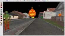
 Contagion
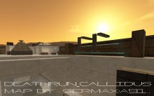
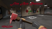
 Team Fortress 2