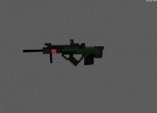
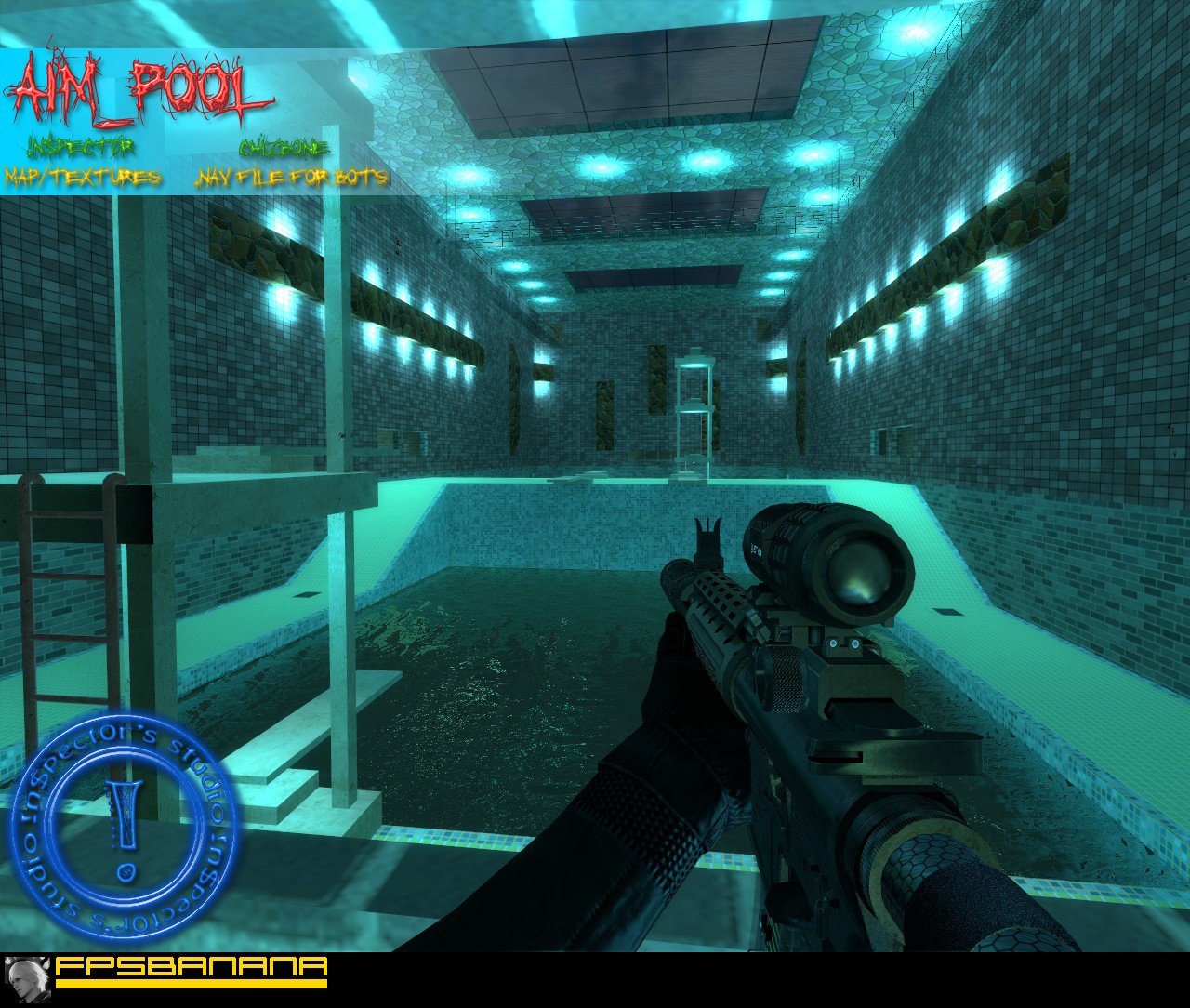
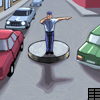
Let's swim!
aim_pool
( )
Oh noes! You're not a Member!
Want access to cool stuff? As a member you can:
- Post. Give the submitter your thoughts on this Map.
- Say Thanks. Show your appreciation by sending the submitter points.
- Stamp Posts. Let other posters know what you think of their posts.
- Rate. Give this Map a rating out of 10.
- Flag. Alert moderators and warn members of a problem with this Map.
- Vote. Vote the submitter for the Monthly Awards.
- Subscribe. Get notified when this submitter submits again.
Comments
-
Pros: menhum Cons: bom Improvements: bom Notes: 10
Bananite -
Awesome map!
Add me to your watchlist -
Pros: Looks fantastic. The custom textures are epic. Really fits in for the pool theme. The layout and idea of the map is pure sechs :D The details are o.k. but could use a little more. Cons: The lighting.. Omgz0r the lighting.. Its very bad :S dont throw light entities around so close to the walls. Place them around the middle of the rooms instead of in the wall. Improvements: The lighting o.O fix it plx :O It really hurt my eyes. Notes: In overall it's a very nice map. I just.. dont really like the lighting
 User TitleTitle goes here.
 -

 Mastergun's Levels
-

P2: Drudge
Points: 3,807 -
E1: Helper
EF: 2 -

C1: Member
-

A5: Veteran
Account Age: 5 years
Pros: it looks simply amazing very nice work i like the textures . did you make them or download them ? the layout is really good and well planned Cons: some props don't really fit the map but thats not a big deal. the FPS are kinda low for me Improvements: well there isn't much to improve on in this map but it could use some more optimization change a couple of props
Notes: the map looks awesome it could use a little fixing but the problems with it aren't horrible so awesome job hope to see more of your maps
 User Titlerun, gun, reload
 -
-
 The BucKeT's Levels
-

P3: Peasant
Points: 23,697 -

E5: Opinion Leader
EF: 185 -

C2: Ripe Member
-
A5: Veteran
Account Age: 4 years
 UsernameThe BucKeT
Hey in$pectOr
Man, you map looks awesome. You really did a fine job. The brushwork is nothing less than fabulous and the custom textures are the bomb. Your map is very original and the design/layout is excellent. Every texture matches the theme and you can sure tell that you are quite the artist.You did such a great job that I hate to even bring up the few small items that imo would improve this map.
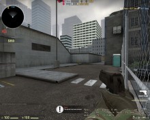
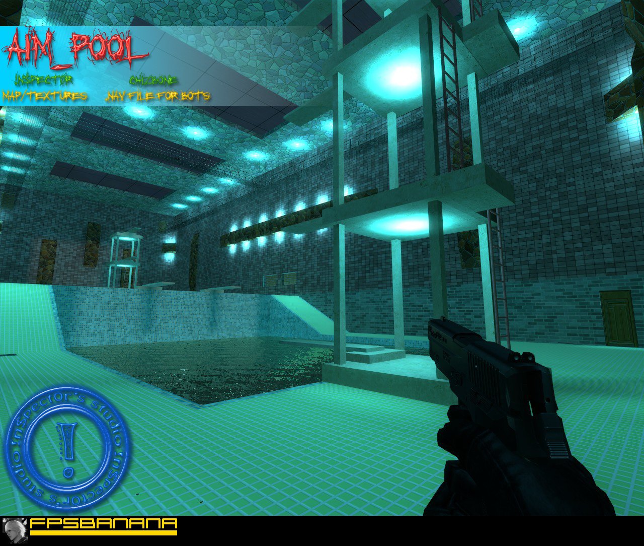
The biggest issue imo is the lighting, as nosoul mentioned.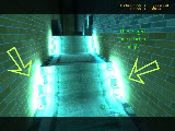 Here is an example of where the lighting seems to bright. There are so many lights in one area that you could dim each of these lights to around 50 or less and still have plenty of light.
As you can see in this screenshot
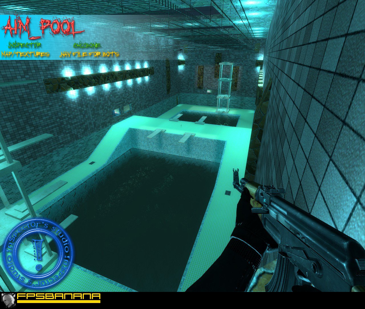
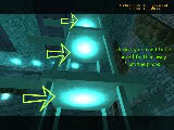 the lights are to close to the props. It gives the appearance of a big spot of light and you cant even tell there is a prop/light fixture in place.
One last con would be the upper platform on the diving boards. I found it very difficult to climb the ladders on the upper levels. I would suggest making the platforms beneath the ladders a bit larger.
Ill end on a good note. The catwalk that runs above the pool is excellent.
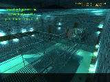 I personally feel this is the best part of the map. It looks so real. I'm jealous, lol.
 Final notes: You really out did yourself buddy. The map looks like you spent weeks on it. Very sweet map. It was a pleasure to assess this map. Over all the lighting is very good, its just need some minor adjustments. Also you might want to consider running this map through pakrat so you don't have to load the textures in the materials folder.
HAPPY MAPPING!!!
 User Title-= DON'T BLINK, JUST WINK =-
 -
-
 Teh Inspector's Levels
-

P4: Worker
Points: 25,514 -

E2: Guide
EF: 29 -
C1: Member
-
A5: Veteran
Account Age: 4 years
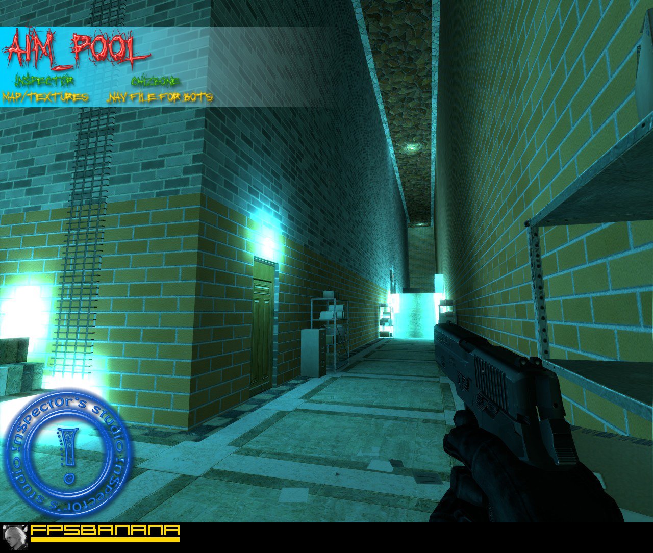
Posted by manslayer111 Pros: The lighting is done very well. The cyan color to parts of the map really set a good theme look to it and the HDR makes a big difference, it looks pretty good. Also you have a fairly good design. Cons: I strongly recommend you chance the file cabinets and shelves to something else, it doesn't make sense why they're there. You have a pool theme and then the file cabinets...they need to go. I can't suggest anything to you at the moment cause it's been way too long, but I'm sure you can find something. Also, I am surely not a fan of the symmetrical design. Try and make the sides just a little different design-wise, not the props on each side, I mean like the walls and such. Also, In my opinion you should lower the upper walkways. Improvements: Not much that I can see. Just make the props more fitting to this map. Make the walls less boring, add some detail to them. Notes: Not Bad.I wll try to use different models in v2 About symmetrical design: I wanted it to make 50/50 - gameplay/reality, something like poolday. So I did not add more details.
Thanks for constructive feedback!
 User TitleThoughtless
 -
-
 manslayer111's Levels
-

P6: Merchant
Points: 238,149 -
E1: Helper
EF: 4 -
C1: Member
-

A6: Elder
Account Age: 7 years
Pros: The lighting is done very well. The cyan color to parts of the map really set a good theme look to it and the HDR makes a big difference, it looks pretty good.
Also you have a fairly good design. Cons: I strongly recommend you chance the file cabinets and shelves to something else, it doesn't make sense why they're there. You have a pool theme and then the file cabinets...they need to go. I can't suggest anything to you at the moment cause it's been way too long, but I'm sure you can find something.
Also, I am surely not a fan of the symmetrical design. Try and make the sides just a little different design-wise, not the props on each side, I mean like the walls and such.
Also, In my opinion you should lower the upper walkways. Improvements: Not much that I can see. Just make the props more fitting to this map. Make the walls less boring, add some detail to them. Notes: Not Bad.
Judge not whom you know not. -
-
 nosoul's Levels
-
P3: Peasant
Points: 16,763 -

E4: Teacher
EF: 115 -
C2: Ripe Member
-
A5: Veteran
Account Age: 6 years
 UsernamenosoulPosted by !n$pect0r Thanks for constructive feedback! I wll try to make bumpmaps) Those textures were not yellow-green - they green, lol. It's because of lightning You mean I need to remove HDR? I'll better try to optimize it) Also I'm thinking of making v2. There will be second floor between the first floor and upper walkways. What do you think about it?
It's good that you will make some bump maps for it then, it will look pretty sweet. As for the HDR, I say keep it because it makes the map look so damn good. I think that a section in the middle would be nice if you can implement it well.
Let me know about a v2!
 User TitleWhy I laggin?
 -
-
Teh Inspector's Levels
-
P4: Worker
Points: 25,514 -
E2: Guide
EF: 29 -
C1: Member
-
A5: Veteran
Account Age: 4 years
Posted by nosoul Pros: Wow, this is a pretty sweet map. I love the use of custom textures, and bumpmaps and with HDR, it looks amazing. The layout is nice and both teams have many directions to go and lots of places to hide and camp. I like how you made the custom tile textures still look nice even though you tiled them over a large area, good job. Cons: Well there area few minor things I noticed while playing this map.- The frame rate with HDR on is a little bit on the low side, nothing too bad, but if there was a huge firefight with 32 people, it might get messy.
- I also thing that the lights in some places are too bright. The ones on the ceiling and in the pool I think are fine, but the ones over the doors and on the diving structure seem too have too much glare to them.
- I think you should have made a custom bump map for the yellow-green tile around the pool, it would look great!
Thanks for constructive feedback! I wll try to make bumpmaps) Those textures were not yellow-green - they green, lol. It's because of lightning You mean I need to remove HDR? I'll better try to optimize it) Also I'm thinking of making v2. There will be second floor between the first floor and upper walkways. What do you think about it?
User TitleThoughtless -
-
nosoul's Levels
-
P3: Peasant
Points: 16,763 -
E4: Teacher
EF: 115 -
C2: Ripe Member
-
A5: Veteran
Account Age: 6 years
Usernamenosoul
Pros: Wow, this is a pretty sweet map. I love the use of custom textures, and bumpmaps and with HDR, it looks amazing. The layout is nice and both teams have many directions to go and lots of places to hide and camp. I like how you made the custom tile textures still look nice even though you tiled them over a large area, good job. Cons: Well there area few minor things I noticed while playing this map.
- The frame rate with HDR on is a little bit on the low side, nothing too bad, but if there was a huge firefight with 32 people, it might get messy.
- I also thing that the lights in some places are too bright. The ones on the ceiling and in the pool I think are fine, but the ones over the doors and on the diving structure seem too have too much glare to them.
- I think you should have made a custom bump map for the yellow-green tile around the pool, it would look great!
User TitleWhy I laggin? -


Credits
- Submitter
-
Teh Inspector (Creator/Co-creator)Teh Inspector's Levels
-
P4: Worker
Points: 25,514 -
E2: Guide
EF: 29 -
C1: Member
-
A5: Veteran
Account Age: 4 years
-
- Studio
-
 StudioWreckreations Inc
 - Key Authors
-
- !n$pect0r aka servicepack
- Unknown
- chizbone
- Unknown
Rating
8.78/10
Based off 7 rating(s)
Additional Info
- Development State
- Final/Stable
- Version
- 1.0
- Maximum Players
- 32
Stats
- Post Count
- 10
- ViewCount
- 2,110
- Downloads
- 451
- Date Added
- 4 years ago
- Date Modified
- 4 years ago
DevNotes
License
N/A
Share

SubFeed
-
2 mins ago:
Details
- Section
- Skins
- Submitter
- Dr.Squeeze
- Game
-
 Ace of Spades
-
3 mins ago:
Details
- Section
- Threads
- Submitter
- PixelBlast
- Game
-
 Counter-Strike: Source
- 39 mins ago:
-
1 hour ago:
Details
- Section
- Maps
- Submitter
- TaskuVaras
- Game
-
 Counter-Strike: Global Offensive
-
1 hour ago:
Details
- Section
- Maps
- Submitter
- .:SeRMaXa91:.
- Game
-
 Counter-Strike 1.6
- 2 hours ago:
- 2 hours ago:
-
2 hours ago:
Details
- Section
- Ideas
- Submitter
- The Giblets of Jesus
-
3 hours ago:
Details
- Section
- Threads
- Submitter
- Tabajara 7.7
- Game
-
 Contagion
- 4 hours ago:
-
4 hours ago:
Details
- Section
- WiPs
- Submitter
- Tabajara 7.7
- 4 hours ago:
- 4 hours ago:
-
4 hours ago:
Details
- Section
- Sprays
- Submitter
- Julius Harder
- Game
-
Counter-Strike: Source
-
4 hours ago:
Details
- Section
- Sounds
- Submitter
- Techno_Lad97
- Game
-
 Team Fortress 2
- 5 hours ago:
-
5 hours ago:
Details
- Section
- Maps
- Submitter
- Julius Harder
- Game
-
Counter-Strike: Source
- 5 hours ago:
- 5 hours ago:
- 5 hours ago:
- 6 hours ago:
- 6 hours ago:
- 6 hours ago:
- 6 hours ago:
-
6 hours ago:
Details
- Section
- WiPs
- Submitter
- FBalazs369