Banner

Repeat

End

Forums

HavenForts: Construct JetFists - The Chronicles of Wargasm (Episode 2, NeoForts)

Go Back   SourceForts > SourceForts > Ideas & Suggestions
Register FAQ Members List Calendar Search Today's Posts Mark Forums Read

Reply
 
LinkBack Thread Tools Search this Thread Display Modes
  #1  
Old 07-03-2009
Kohan's Avatar
Experienced Builder
 
Join Date: Dec 2006
Posts: 268
Default New Logo Concept (Requesting Constructive Criticism)

I realize that I'm probably going to be eaten alive, but please, instead of just saying that it sucks, explain why it sucks, and/or how it could be improved. Thank you.

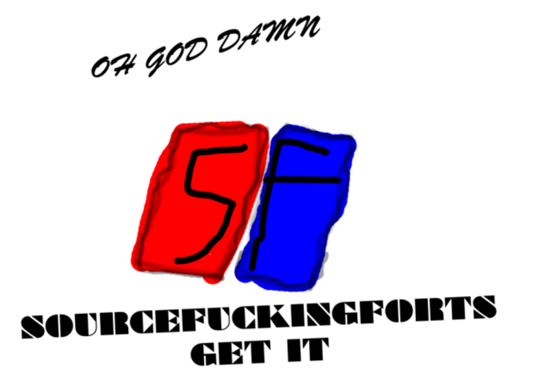
I wanted to get away from the Half-Life 2 logo while maintaining the 'building blocks' element. At the same time, I wanted to simplify it to make it look better at low resolutions, and add in a little color. The result:


And also, a wee 16-pixel version for the thumbnail in Steam:

Again, please give your responses some content so that I can improve this. I just came up with it off the top of my head; it's not intended to be refined yet.
__________________
Truth | Sarcasm
Reply With Quote
  #2  
Old 07-03-2009
Jake's Avatar
♥electrohouse
Veteran Fort God
 
Join Date: Jan 2007
Location: New York
Posts: 6,540
Send a message via MSN to Jake
Default

Something just looks off to me. I can't really put my finger on it.
__________________

proof sol said it
Reply With Quote
  #3  
Old 07-03-2009
Kohan's Avatar
Experienced Builder
 
Join Date: Dec 2006
Posts: 268
Default

Yeah, Draken was saying the same thing. Something even looks a bit off to me, but I can't figure it out either >.<. Hopefully someone else can see it.

As a shot in the dark, here it is without the block shadows, and with a border:


Edit: My God that border is disgusting.

Also, with half-shadows:


Ew. Well, this isn't working >.>
__________________
Truth | Sarcasm

Last edited by Kohan; 07-03-2009 at 02:17 AM.
Reply With Quote
  #4  
Old 07-03-2009
arenaceous's Avatar
Flag Capper
 
Join Date: Oct 2006
Location: in a dormroom
Posts: 2,655
Default

its just some boxes. there constructive criticism.

*edit

also overuse of "photoshop" boxes

Arena was banned for this post. - Draken
__________________
Quote:
Originally Posted by mc_nebula View Post
Guys, Serious thread are serious business.
11:29 p.m. - ☢ AZgAg: did the fgd was moved?

Last edited by Draken; 07-03-2009 at 02:36 AM.
Reply With Quote
  #5  
Old 07-03-2009
Veteran Fort God
 
Join Date: Sep 2006
Posts: 5,851
Default

I think the concept/shape of it looks good. Just the fact it's mostly using primary colours, might be the thing that's causing it to look off. Plus the drop shadow might be a bit too deep.

Might as well critic mine so you're not alone .


Oh and Arena, that joke got kind of old when every one used it for like two weeks straight.

Last edited by Black™; 07-03-2009 at 02:31 AM.
Reply With Quote
  #6  
Old 07-03-2009
Kohan's Avatar
Experienced Builder
 
Join Date: Dec 2006
Posts: 268
Default

Quote:
Originally Posted by arenaceous View Post
also overuse of "photoshop" boxes
I actually hadn't even thought of that when I made them. Originally they were just unshaded primary colors, but that didn't look very good, and a white background made the top box invisible.

Quote:
Originally Posted by Black™ View Post
Plus the drop shadow might be a bit too deep.
Yeah, I was thinking that, too. The reason it's that deep is so that the colors divide evenly when scaled down to 16x16. Maybe they'd look better if dropped less; let's see...


Ooh, that just might have been it. What do you think?
__________________
Truth | Sarcasm
Reply With Quote
  #7  
Old 07-03-2009
arenaceous's Avatar
Flag Capper
 
Join Date: Oct 2006
Location: in a dormroom
Posts: 2,655
Default

black that just is the 195 logo with except its black with blue glow.
__________________
Quote:
Originally Posted by mc_nebula View Post
Guys, Serious thread are serious business.
11:29 p.m. - ☢ AZgAg: did the fgd was moved?
Reply With Quote
  #8  
Old 07-03-2009
Veteran Fort God
 
Join Date: Sep 2006
Posts: 5,851
Default

Think it's looking better.

Quote:
Originally Posted by arenaceous View Post
black that just is the 195 logo with except its black with blue glow.
Reply With Quote
  #9  
Old 07-03-2009
cobtehfood's Avatar
needs moar
Experienced Builder
 
Join Date: Dec 2006
Location: USA
Posts: 433
Send a message via AIM to cobtehfood
Default


basically better than what ever you guys would make ever
__________________
Reply With Quote
  #10  
Old 07-03-2009
Veteran Fort God
 
Join Date: Sep 2006
Posts: 5,851
Default

Gradients, it's ALRIGHT.
Reply With Quote
Reply


Currently Active Users Viewing This Thread: 1 (0 members and 1 guests)
 
Thread Tools Search this Thread
Search this Thread:

Advanced Search
Display Modes

Posting Rules
You may not post new threads
You may not post replies
You may not post attachments
You may not edit your posts

BB code is On
Smilies are On
[IMG] code is On
HTML code is Off
Trackbacks are On
Pingbacks are On
Refbacks are On


All times are GMT +1. The time now is 05:04 AM.


Powered by vBulletin® Version 3.8.0
Copyright ©2000 - 2012, Jelsoft Enterprises Ltd.
Search Engine Optimization by vBSEO 3.6.0

Tab